Introduction — Why this matters
Have you ever opened Lightroom, felt stuck, and wished for a shortcut to a great look? That’s exactly where presets shine. In this photography tip 98, I’ll show you why presets are excellent starting points, how to use them without losing creative control, and how to make them truly yours. Think of presets like a cookbook’s recipe — a helpful base to customize, not a rule book that shackles you. Ready to speed up your edit flow and sharpen your style? Let’s jump in.
Why presets aren’t cheating: mindset & benefits
There’s a small chorus that calls presets “cheating.” But here’s the truth: using a preset is no different from using a lens, a flash, or a film simulation. It’s a tool. The benefits are real: massive time savings, consistent looks across a series, and immediate inspiration when you don’t know where to start. If presets make you more productive and help you iterate faster, they’re doing their job.
What’s the real value?
- Save time on repetitive tasks.
- Explore different color palettes and tones fast.
- Build a cohesive brand look across shoots.
- Learn by reverse-engineering edits you like.
What exactly is an editing preset?
A preset is a saved set of adjustments — exposure tweaks, tone curve changes, color grading, sharpening, split toning, and sometimes local adjustments — that you can apply to images with one click. Presets exist across platforms (Lightroom, Capture One, Photoshop actions), and they range from subtle film emulations to bold, stylized looks.
Preset vs filter: what’s the difference?
Filter: often a single-layer effect (common in phone apps) that applies a fixed transform.
Preset: a collection of editable parameters that you can tweak after applying. Filters are one-click finishes; presets are one-click beginnings.
Common file types: Lightroom, Capture One, Photoshop Actions
.xmp / .lrtemplate — Lightroom Classic / Lightroom.
Capture One style files and .preset — Capture One.
.atn — Photoshop actions. Knowing your format keeps your workflow smooth.
When to use presets
Batch edits and speed
When you have dozens or hundreds of images (weddings, events), apply a preset to get consistent base edits and then fine-tune. It’s not lazy — it’s efficient.
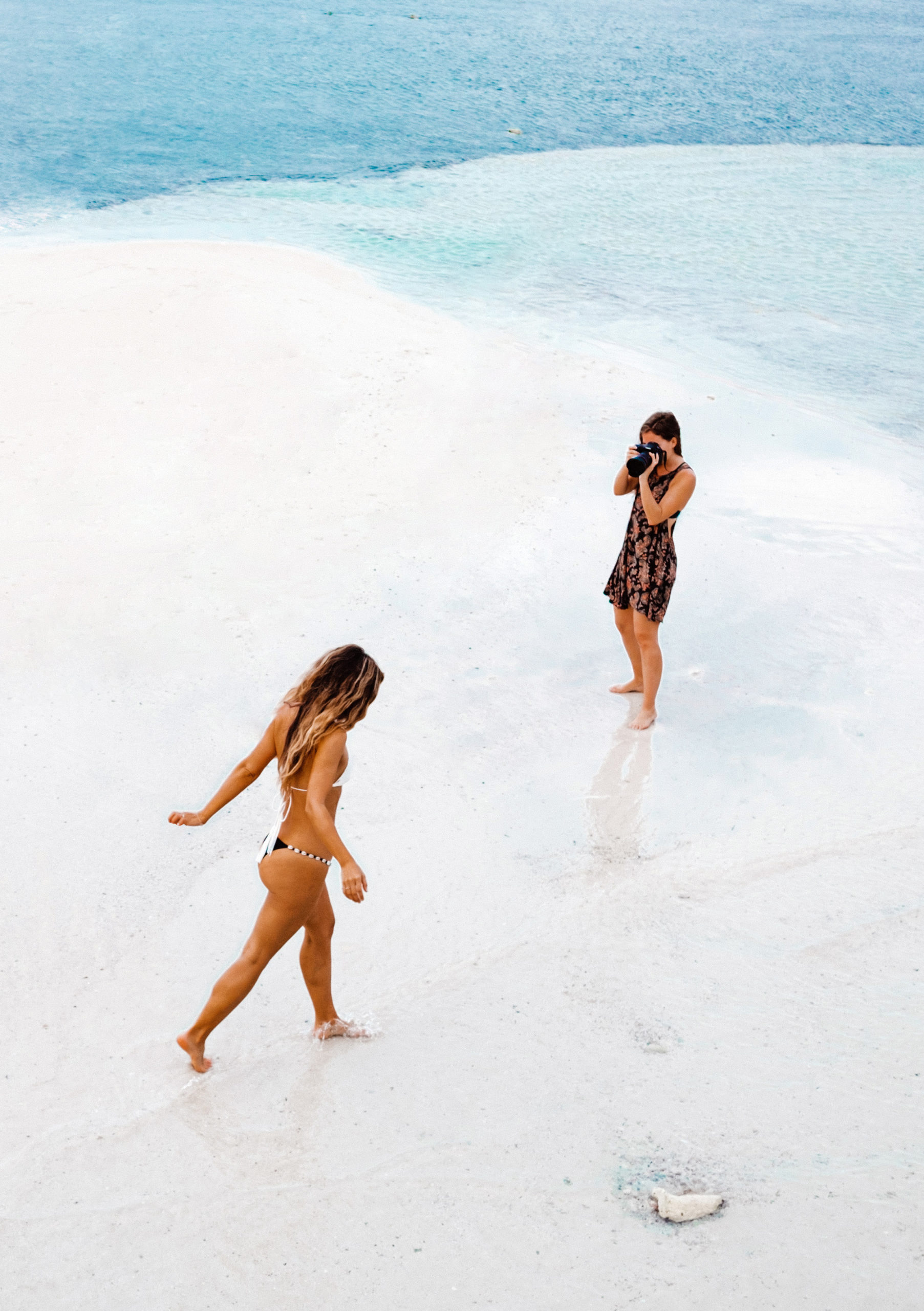
Exploring a mood or look
Trying to see if a series should be moody and desaturated or punchy and high-contrast? Presets let you preview multiple routes instantly.
When not to use them
– When skin tones are critical and a preset destroys natural color.
– For heavily under/overexposed RAW files that need bespoke recovery.
– When a single image is your magnum opus — sometimes full manual craft is preferable.
How to choose the right preset for a photo
Picking a preset isn’t random. Ask: does the preset match the photo’s light, color, and mood?
Match lighting and color palette
A preset meant for golden-hour landscape may choke a neon-street portrait. Look at white balance, dynamic range, and color palette first.
Test on representative images
Before batch-applying, test the preset on 3–5 images that represent the shoot’s variety: a shadow-heavy shot, a midtone, and a highlight-heavy shot. That’ll reveal whether the preset scales well.
A step-by-step preset workflow
Here’s a practical, replicable flow that keeps you fast and in control:
Import RAW → Apply preset → Tweak
- Import RAWs and cull first.
- Apply your chosen preset to one representative RAW.
- Adjust white balance and exposure to fit the image.
- Tweak contrast, shadows/highlights, and presence as needed.
- Use local tools (brush, radial, gradient) for skin, eyes, skies.
- Sync or copy settings across similar images and fine-tune individually.
Local adjustments and finishing touches
A preset rarely nails local work — dodging someone’s eyes, softening skin, or dehazing a sky usually needs a brush or gradient. Always finish with targeted local edits.
Customizing presets — make them your own
The secret pro move: don’t blindly apply — adapt.
Save variations and name clearly
Create versions: “Portrait — Warm Skin v1”, “Landscape — High Contrast v2”. Good naming saves time and sanity.
Branding your look
If you want a signature style, start with one preset and build variations. Consistency helps clients recognize your work across platforms.
Common mistakes to avoid with presets
Over-application & ignoring skin tones
A preset that crushes shadows or adds heavy magenta can ruin skin. Always check faces closely and back off saturation or tint for natural skin.
Not checking shadows/highlights
A preset might clip highlights or floor shadows. Use the histogram and highlight/shadow indicators to keep detail.
How to create your own presets
Start from a strong base image
Choose a RAW with pleasing light and balanced exposure. Build edits from there: clarity, tone curve, HSL tweaks, sharpening.
Organize, export, and backup
Export presets with clear names and keep a backup. Store them in folders: “Portraits”, “Weddings”, “Landscape”.
Free vs paid presets — pros & cons
Free presets: great for learning and experimentation, often lower quality but low risk.
Paid presets: often polished, consistent, and come with support or tutorials. Not a substitute for judgement, though — pay only if they accelerate your workflow or teach you something.
Learning from presets
Open the adjustment panels after applying a preset and study what changed. This reverse-engineering is one of the fastest ways to learn color grading and tone curve tricks.
Presets for different genres
Presets aren’t one-size-fits-all. Here’s a quick look:
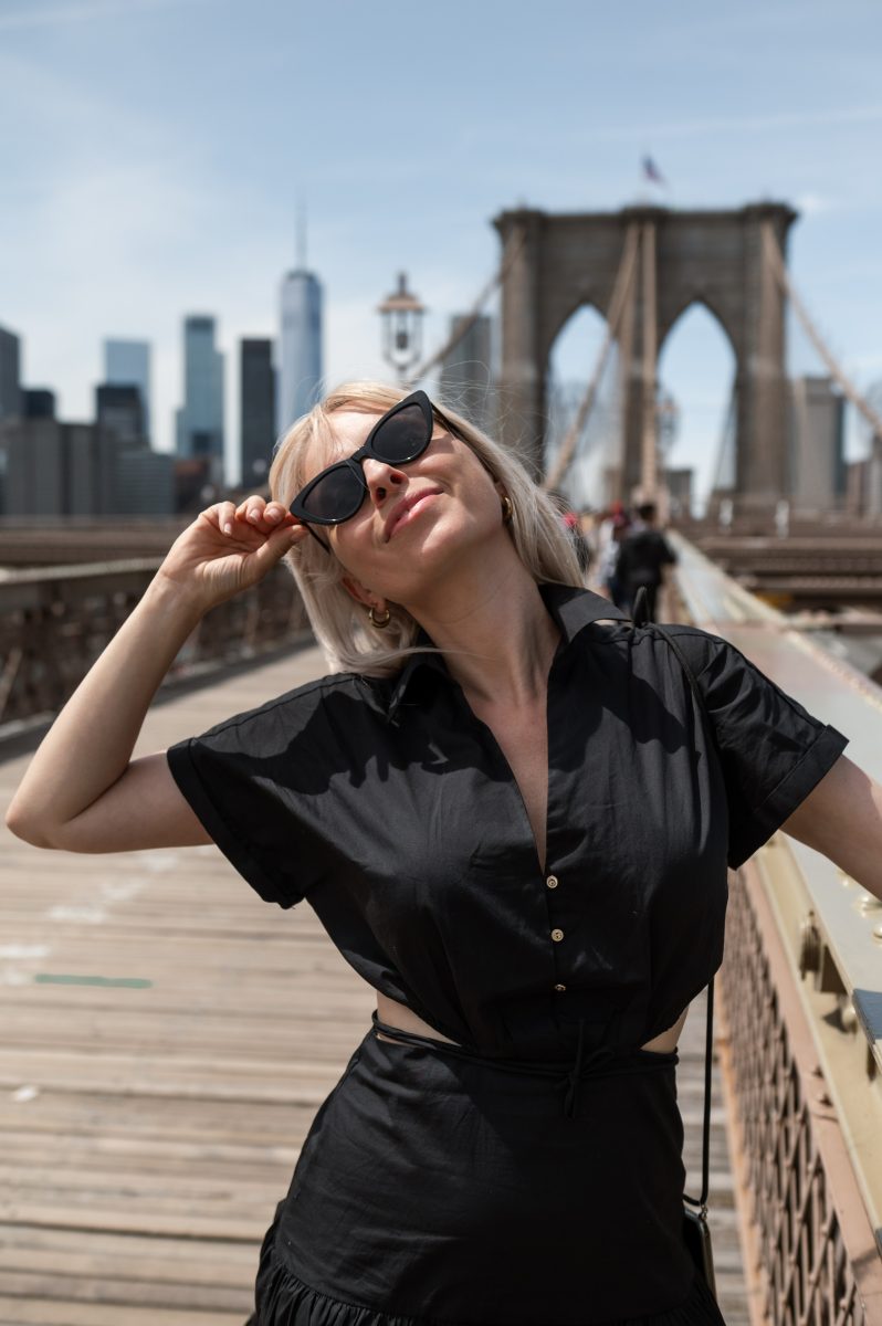
Portraits
Prioritize skin tone preservation, gentle clarity, and negative sharpening on skin while maintaining eye detail.
Landscapes
Boost micro-contrast, clarity in midtones, and targeted vibrance for skies and foliage. Watch for over-saturation.
Street
Contrast, film grain, and punchy blacks often work well. Keep highlights intact to preserve city lights.
Product
Neutral whites and accurate color reproduction are critical; presets should enhance detail without altering brand colors.
Examples of adjustments per genre
- Portrait: -10 clarity, +8 vibrance, careful tone curve.
- Landscape: +15 clarity, +10 contrast, split-tone cool shadows/warm highlights.
- Product: +5 clarity, precise white balance, minimal color grading.
Testing and quality control
Test on multiple skin tones and exposures
Inclusivity matters. A preset that looks great on one skin tone might desaturate or oversaturate another.
Print vs screen considerations
Colors and contrast shift from screen to print. If you print, test a few images before final export settings.
Presets + batch processing = efficiency
Real-world time-saver examples
– Wedding: apply a base preset to each contact sheet — one hour of work becomes 10–15 minutes per gallery.
– Real estate: consistent color and exposure across dozens of rooms in a single pass.
– Social media: apply branded preset to maintain feed consistency.
Ethical & copyright considerations
Credit creators when required
If you use or sell someone else’s preset, read the license. Credit authors when required and don’t resell presets unless allowed.
“CameraTale.com is your go-to hub for actionable photography tips, tricks, and gear insights. Elevate your shots with expert guidance, one tip at a time.”