Photography Tip #91 is all about creating a mood with color tones. Whether you’re an amateur photographer or a seasoned pro, the way you use color can have a profound impact on the emotional vibe of your photo. Colors speak louder than words in visual storytelling, influencing everything from warmth and calm to intensity and drama. By understanding how to use color effectively, you can completely transform the feel of your images. So, let’s dive into how color tones can be used to your advantage.
The Power of Color in Photography
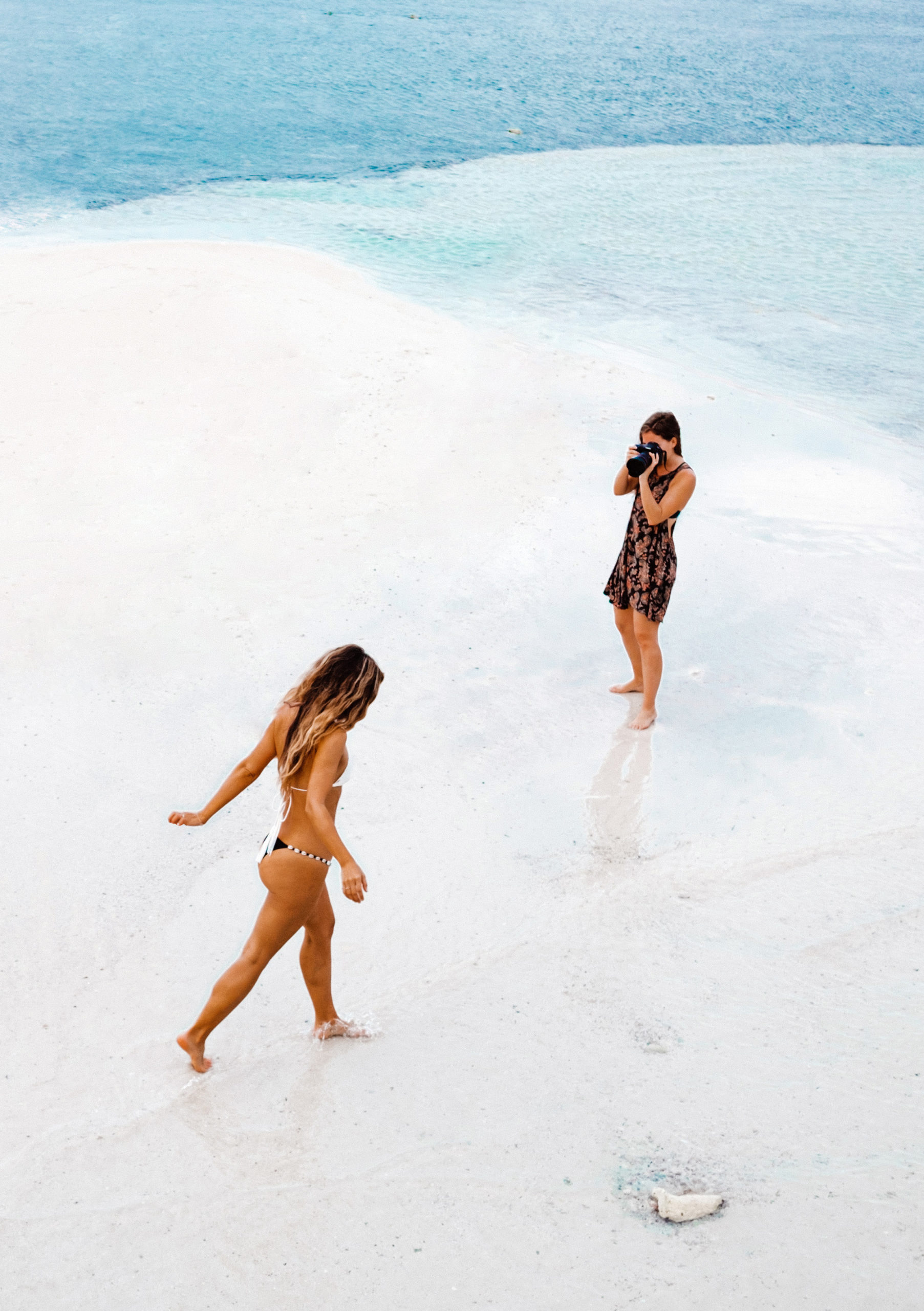
Colors are more than just a visual element; they are an emotional language. Imagine looking at a photograph of a golden sunset—warm tones immediately evoke feelings of calm and nostalgia. On the other hand, a cold, blue-toned image of a city skyline might make you feel more detached or even melancholic. Understanding this power is crucial for every photographer who wants to convey a particular feeling or mood through their work.
How Color Affects Emotions
The way colors affect emotions is rooted in psychology. Here’s how:
- Warm colors like red, orange, and yellow are stimulating and evoke feelings of warmth, excitement, and energy. These colors are often associated with passion, warmth, and even anger.
- Cool colors such as blue, green, and purple tend to be calming and peaceful, often associated with tranquility, sadness, or introspection.
- Neutral colors like beige, grey, and white bring balance and simplicity, giving a photograph a more subdued and professional feel.
Warm vs. Cool Colors
Understanding the difference between warm and cool colors can make a huge difference in how you approach your photography.
- Warm colors create an inviting atmosphere, which is perfect for portraits, close-ups, or outdoor photos during golden hour.
- Cool colors, on the other hand, are ideal for more dramatic or tranquil shots, like those taken at dusk or with artificial lighting.
By strategically using these color categories, you can manipulate how your audience perceives the photo.
Understanding Color Temperature
Color temperature is a critical aspect when working with mood in photography. Essentially, it refers to the warmth or coolness of the light in your photo.
- Warm light has a golden or reddish tint, often seen during sunrise or sunset.
- Cool light is bluish in nature and can be found in shadowed areas or on overcast days.
Knowing how to control color temperature through your camera settings or post-processing can help you create the right mood for your image.
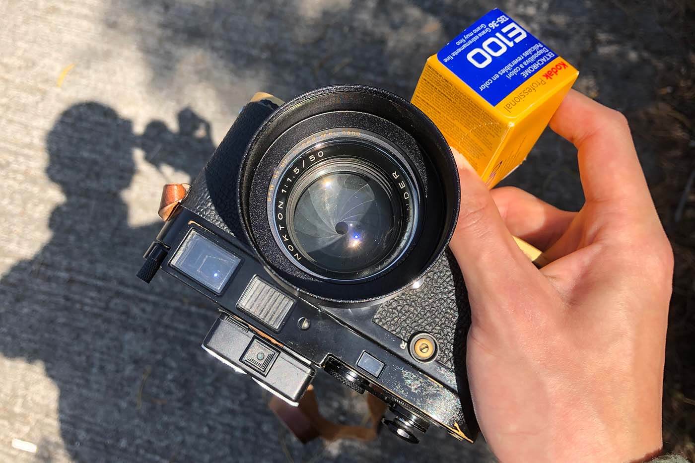
Adjusting White Balance
In digital photography, white balance is a vital tool for adjusting color temperature. Setting the right white balance ensures that the colors in your image are accurate and natural.
For instance, if you shoot under incandescent lighting, the image might turn out too yellow. Adjusting the white balance to “tungsten” will correct the color temperature and bring back the natural tones.
Common Mistakes to Avoid with White Balance
A common mistake is ignoring white balance altogether or using the auto white balance setting, which might not always deliver the desired effect. It’s better to take control and experiment with manual settings to fine-tune the mood of your shot.
Color Grading Techniques
Once you’ve captured your image, the real magic happens during post-processing. Color grading allows you to push the emotional tone of the photo even further. Tools like Lightroom and Photoshop can be used to modify color tones, shadows, and highlights.
Lightroom vs Photoshop for Color Grading
- Lightroom is fantastic for beginners or anyone wanting a quick, efficient edit. It’s easy to adjust the overall tone of the photo using sliders for temperature, tint, and vibrancy.
- Photoshop gives you more advanced control, allowing you to work with layers, masks, and detailed color adjustments. It’s ideal if you want to add a specific mood or effect.
Basic Color Grading Steps
- Start by adjusting the exposure and contrast to set the foundation.
- Play around with the temperature slider to make the image warmer or cooler.
- Use the hue/saturation sliders to enhance specific colors in your photo.
- Finally, experiment with the split-toning feature for a creative effect.
These steps will help you enhance the mood of your image and evoke the emotions you want to communicate.
Using Color Schemes for Mood Creation
A great way to ensure a cohesive and emotional look is by using color schemes. Here are a few examples:
- Analogous Color Schemes: These are colors that sit next to each other on the color wheel, like blue, green, and teal. They create harmony and tranquility.
- Complementary Color Schemes: These are colors opposite each other on the color wheel, such as red and green. Complementary colors create contrast and tension, which can be dramatic and striking.
Analogous Color Schemes
If you’re aiming for a serene and unified mood, analogous color schemes work wonders. Think of a photograph of a sunset where the sky fades from pink to orange and finally to purple. The colors flow naturally, creating a calm and peaceful atmosphere.
Complementary Color Schemes
For something more dynamic and full of energy, complementary colors are the way to go. Picture a portrait of someone wearing a red shirt against a green backdrop—this contrast creates visual excitement.
Natural vs Artificial Lighting
Lighting plays a pivotal role in creating the right mood with color tones. Natural light tends to create warmer tones, especially during the golden hour. Artificial light, such as LEDs or fluorescents, can give a cooler and more sterile feel to your shots.
Using Natural Light for Warm Tones
For a photo that exudes warmth and comfort, try shooting in the early morning or late afternoon when the light is soft and golden. The warmth of the sun will naturally enhance the mood of the image.
Artificial Lighting for Cooler Tones
If you’re aiming for something more dramatic or futuristic, try using artificial lighting with a cooler color temperature. This can add mystery and depth to your photos.
Conclusion
Color tones are a powerful tool in photography, and Photography Tip #91 shows you how to use them to create moods and tell stories through your images. Whether you choose warm or cool colors, natural or artificial lighting, mastering the art of color manipulation can elevate your work to new heights.
FAQs
1. How can I use color tones to improve my portrait photography?
Use warm colors like red or orange for a cozy, inviting feel. Cool tones like blue or green can create a more contemplative or melancholic atmosphere.
2. What’s the best time of day for capturing warm tones?
Golden hour, just after sunrise or before sunset, provides beautiful natural warm light.
3. Can I change the color mood in post-processing?
Absolutely! Tools like Lightroom and Photoshop allow you to adjust color tones and create the exact mood you want.
4. What’s the difference between analogous and complementary color schemes?
Analogous colors are next to each other on the color wheel, creating harmony, while complementary colors are opposite each other, creating contrast.
5. How do I adjust white balance for different lighting conditions?
Adjust your white balance settings depending on the lighting conditions—use tungsten for artificial lights and daylight for outdoor settings.
-
Mastering Color Tones in Photography
-
Create Mood with Color in Your Photos: Tips & Techniques